I often see in various forums the discussion about whether it is better to use sRGB or ProPhoto , as the output space after developing the raw file.
Unfortunately, just as often, I read the reasons for this and, based on the 3 main ones, I decided to clarify my point of view on the subject.
I would like to proceed in order, taking inspiration, as I said, from some sentences (but I could have found hundreds), which recall the 3 main reasons why it is recommended to use sRGB instead of ProPhoto:
1 – Color fidelity (or precision)
“…the ProPhoto profile is not suitable because it is too large and more faithful results are obtained using sRGB…” or it reads: “…in sRGB you get more precise results than with wider color spaces like AdobeRGB98 or ProPhoto”
2 – The press
“…the ProPhoto profile is useless as sRGB already contains all the colors needed for printing…”
3 – The monitor
“…the ProPhoto profile is useless because the monitor can't represent it, so if you can't control the colors on the monitor they're useless…”
First point: What does 'more accurate results or better fidelity' mean?
I understand that the term 'precision' means the most faithful reproduction of a color, so it must be measured and compared with the original to understand which color space reproduces it with the least error.
To make a serious comparison, however, you need to choose an image that doesn't exceed the sRGB color space. Otherwise, it's natural that wider spaces, like AdobeRGB98 or ProPhoto, can easily win this comparison if you use brightly colored images; they can provide a wider range of colors in the TIFF file!
Since it would be pointless in this case to measure the color in nature and then check its digital reproduction, we simply choose an image with all the color information within the sRGB space and, to do this, we first export it to ProPhoto and then check its colorimetric data with ColorThink Pro. We will then export it again but in sRGB, creating a similar color table to compare whether there is a difference between the two color spaces.
If this were not the case, the 'color fidelity' of the two spaces is the same.
( NOTE: If anyone is interested in the aspect of 'maintaining color fidelity' within the two color spaces, during post production, you can read this article by Marco Noldin and the considerations that the late wrote on ProPhoto Bruce Fraser :
“Kodak actually hired me to do a lot of testing on ProPhoto back when it was still known as ROMM RGB, and after torturing it, I found that I really liked the way it worked. Mainly I like being sure that my choice of working space absolutely will not produce any clipping!”)
Now let's move on to the sRGB vs. ProPhotoRGB test. The image we'll measure for the test must have all the colors that can be represented in both sRGB and ProPhotoRGB. We'll choose a simple portrait with a white wall as a background and, after extracting a color list from it with ColorThink, as shown in the following figure, we'll verify that all the image's Lab data fits within the sRGB profile (in transparent yellow).

Now let's check whether, after developing the raw file, opening in sRGB or ProPhoto causes significant colorimetric differences so that we can doubt whether one is more or less accurate than the other.
Still using ColorThink Pro, I open the two images, previously exported in the two different color spaces, and create a list of their individual Lab colors. The software obtains it from the pixels of the TIFF files which, obviously, refer to the Lab values in sRGB and in ProPhoto. of the same raw image .
As mentioned, it is assumed that if the difference is minimal, using one profile or the other is practically irrelevant.
This image shows the two images side by side and, at the bottom, the list of RGB and Lab colors that the software extracted from the two TIFFs; on the left, the sRGB image and, on the right, the ProPhoto image.
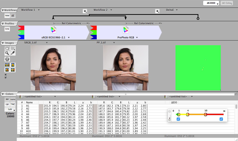
The software calculated the color differences, in deltaE2000, between the actual use of one profile rather than another for the development of a raw file and, to be fair, we chose a raw file with all the colors of the scene within sRGB, the smallest space.
In the figure, you can see the difference in deltaE of 2000 between the two images; the pixels that have a deltaE less than 1 between the two images being compared are in green. We can see that some pixels are yellow (less than ten out of 10,000 pixels!), which means that those pixels have a difference between 1 and 2 deltaE between the two images. In practice, this means that 0.0001% of the pixels are different (between 1 and 2 deltaE).
If we consider that there are different gamma values between the two profiles, therefore the numerical roundings may be slightly different, we can conclude that: developing a raw image (be careful, whose represented colors are included in sRGB) in sRGB or in ProPhoto does not change anything in terms of 'exact' or 'faithful' representation of the final color.
What we cannot establish with this example, however, is which of the two is better in terms of fidelity as we do not have the original color!
In conclusion, we can say that if there are no colors in the image that exceed the sRGB space, using sRGB instead of ProPhoto does not result in greater precision and both spaces are accurate in representing the image.
But what if the colors in your image are outside of sRGB? The conclusion is obvious: ProPhoto represents them more faithfully because it can accommodate them!
In the next case I tried the test again with the X-Rite ColorChecker SG at 140 bars, some with colors evidently outside of sRGB as you can see in the next video.
Note, in the comparison figure below, how all the colors in common between the two spaces are practically the same (green pixels) so the question of which space has 'more accurate results' does not arise, for the colors common to both ICC profiles.
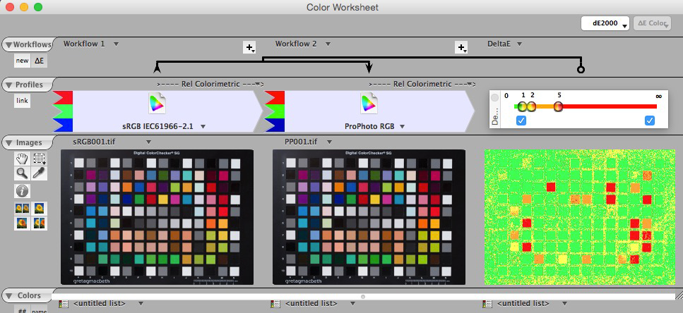
However, the greater difference between the two images, one in sRGB and the other in ProPhoto, is evident for the ColorChecker SG colors that were outside of sRGB and that only ProPhoto can maintain. Again, we don't know their accuracy since we don't have a comparison with the actual ColorChecker SG colors, but from the previous video, it can be deduced that the colors highlighted in red are those outside of sRGB.
At this point, I personally find no reasonable reason to use sRGB instead of ProPhoto. If I consider the "precision" of the color profiles used, the test shows that there is no difference. My workflow, based on the use of 16-bit ProPhoto for both printing and, above all, editing, has always proven preferable and effective, even in cases where it's clear that the image doesn't have any particular colors outside of sRGB or that, ultimately, it's intended for the web. In those cases, I leave the conversion to sRGB until the final stage of saving the JPEG file.
2 – The press
“…the ProPhoto profile is useless as sRGB already contains all the colors needed for printing…”
The statement cited in the previous article under point 2 is completely misleading. While, on a practical level, it's sometimes true in the sense that images printed from sRGB aren't bad and can better adapt to certain print workflows, From a technical point of view, it can certainly be said that this is not the case.
As we mentioned in the previous article, it all depends on the colors contained in the image itself. So while sRGB may work fine for some images, for others it's essential to use broader spaces like Adobe RGB98 or, even better, ProPhoto RGB.
Let's try to explain why. The gamut of a printer, described in the ICC profile that belongs to it, represents the quantity of colours that it can represent. And these colors may not necessarily be present in the image. We've seen that if the image's colors are contained in sRGB, choosing this color space or a broader one doesn't change the accuracy.
But if the colors in the image exceed sRGB (often the norm) and the printer could reproduce them, Converting them to sRGB for printing is not a good idea. It's therefore important to determine whether the various printing technologies allow for colors outside of sRGB. This would mean that choosing sRGB for printing isn't the best option if we want to take advantage of the printer's full gamut and preserve any colors photographed.
Let's see, for example, some comparisons between the sRGB profile (always in green) and some printers (always in real colors)
A- sRGB vs FOGRA39 offset printing machine
In this comparison you can see that sRGB does not contain full yellow and many light blues and blues
B- sRGB vs chemical printer (Durst Lambda on Fuji Duratrans)
In this comparison you can see that sRGB does not contain many full and clear yellows, many blues and light blues and even magenta tints.
C- sRGB vs inkjet printer (Epson SP4900)
In this comparison you can see that sRGB does not contain very many colors that the printer can reproduce, practically all the hues with maximum saturation
D- sRGB vs Japan Standard Newspaper (Japan Standard Newspaper Paper)
In this comparison, I found a printing press profile whose colors are all representable in sRGB. I searched through all the profiles I'd created for one small enough for this comparison, but I couldn't find one, not even among the poorest ones. The only standard profile that meets these requirements is a newspaper paper profile according to a Japanese printing standard.
Even for printing, unless it's for a newspaper, the sRGB color space isn't enough to fully utilize a printer's gamut. Therefore, it's not the most appropriate choice.
If you'd like to continue on this topic, I invite you to read this article by Mauro Boscarol.
The third and final point on which I would like to clarify my point of view concerns the monitor profile and the importance or otherwise given to it in choosing between sRGB or ProPhoto.
3 – The monitor
“…the ProPhoto profile is useless because the monitor can't represent it, so if you can't control the colors on the monitor they're useless…”
What does my monitor profile have to do with choosing between sRGB and ProPhoto? Why should I reduce the colors in my image to those only my monitor can display?
If any part of this statement is correct ( your monitor cannot display the colors contained in ProPhoto) the rest has nothing to do with choosing a workspace!
The monitor is a device in itself that is represented by a color profile, it must be calibrated periodically and its profile is installed at the operating system level. Selecting the monitor profile in Photoshop's color settings, for example, is a mistake because it disables color management in RGB mode and assigns the working space without taking into account the correct profile embedded in the document. This choice often comes from the bizarre phrase quoted above: “if I can’t see the true colors of my image because they are not reproducible by my monitor, then I compress them all into the space of the monitor itself.”
Consider that the best monitors on the market cover the entire Adobe RGB98 color space, much more than sRGB, but in certain colors, printers are still superior, as you can see in the next video. Therefore, even Adobe RGB98 often falls short as an optimal color space for printing, let alone sRGB.
The video shows the profile of an Epson 9900 printer in Adobe RGB98 red and in true colors on Hahnemühle Photo Rag Baryta paper.
In conclusion, I will describe my workflow based on ProPhoto. I do not claim that it is perfect, but from personal experience, the ProPhoto-based workflow is neither dangerous nor imprecise, on the contrary.
Personally, I use Lightroom as a raw file manager and, when I have to pass the image into Photoshop, I usually do it in Tiff with ProPhoto ICC profile and 16 bit.
After the necessary image editing in Photoshop, I save it and find it in Lightroom, always in 16-bit ProPhoto, from where, if necessary, I can print it directly. If, however, I need to publish it on the web, I export it as a JPEG, converting it to sRGB.